anyRM digital environments platform
Elevating anyRM, the next-gen intranet solution for healthcare and pharma
Born from Peakfactor's vision, anyRM serves as a pioneering platform, streamlining communication for professionals in healthcare, pharmaceuticals, and chemicals sectors.
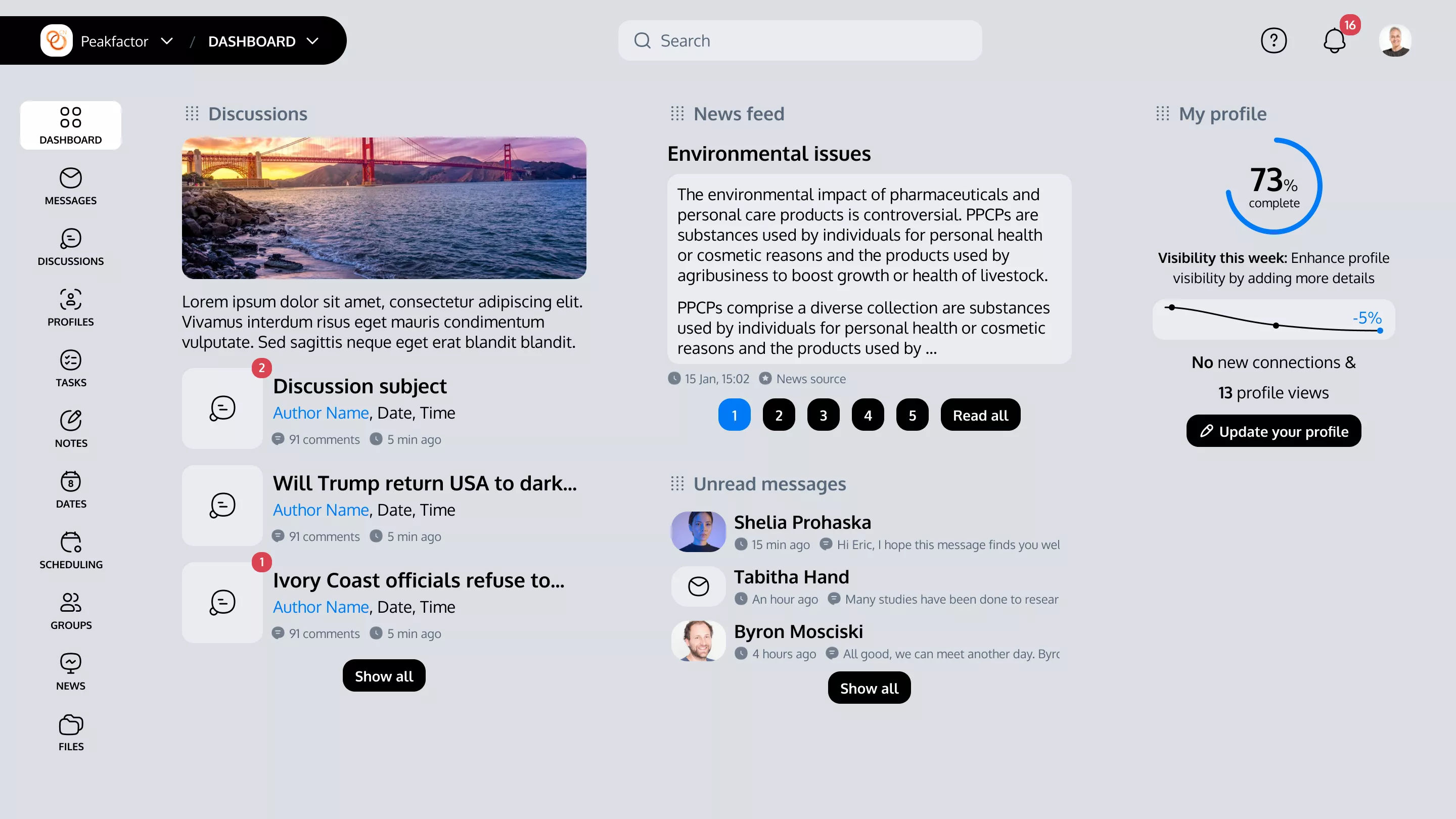
My challenge was to consolidate and refine previous systems features into a seamless, user-friendly interface. The primary goal for this iteration, dubbed Factor 3, is to integrate the functionalities of Factor1 and Factor2. This integration is designed with a dual focus: enhancing overall usability while keeping backend modifications to a minimum.
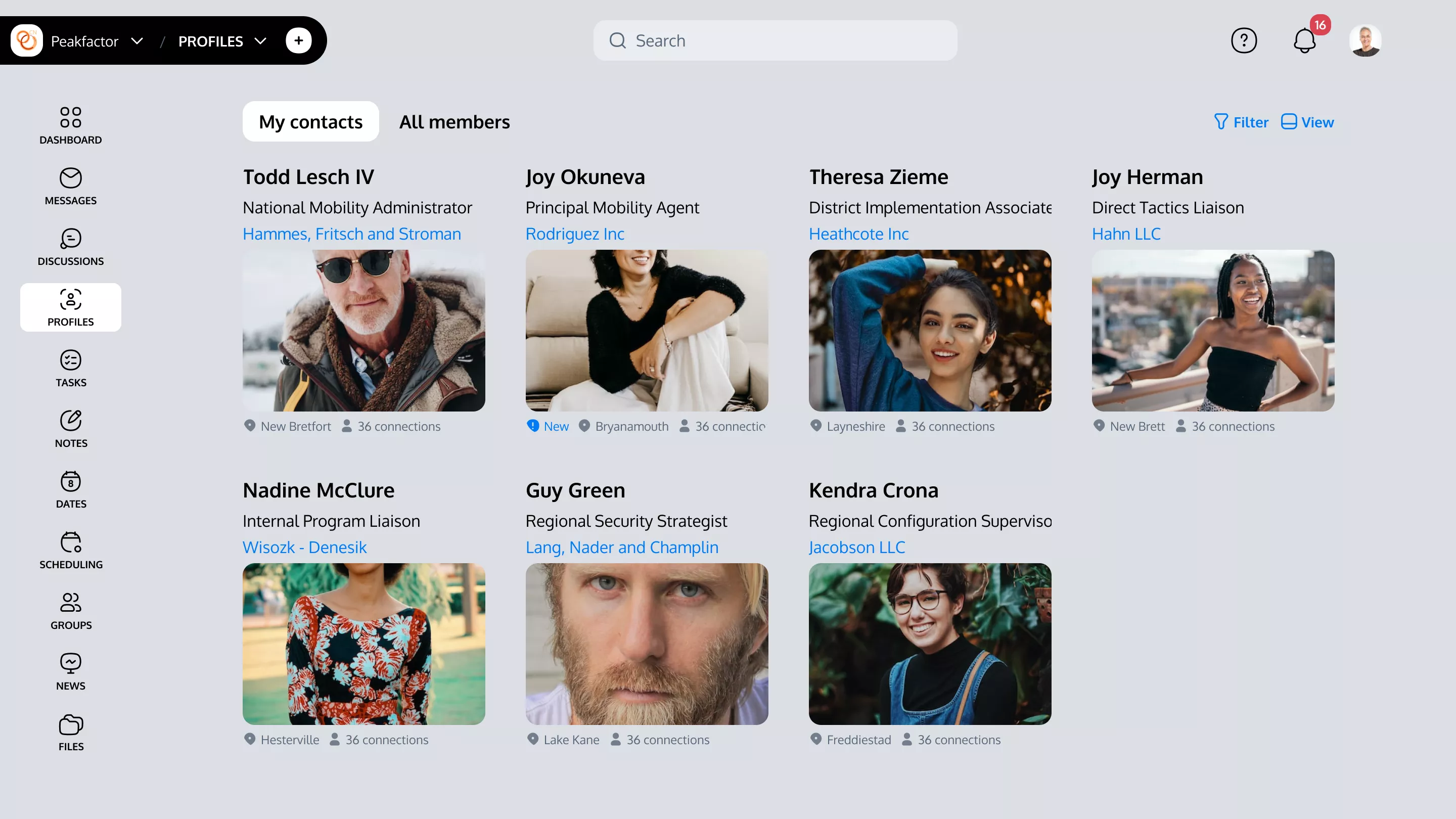
Targeting medical staff, researchers, and industry administrators, our redesign aims to facilitate effortless workflow and robust industry connectivity, positioning anyRM as the cornerstone of intranet solutions in these vital sectors.
Design Strategy
- Redefine navigation to streamline workspace and clarity.
- Propose a fresh design following clean and user-friendly principles.
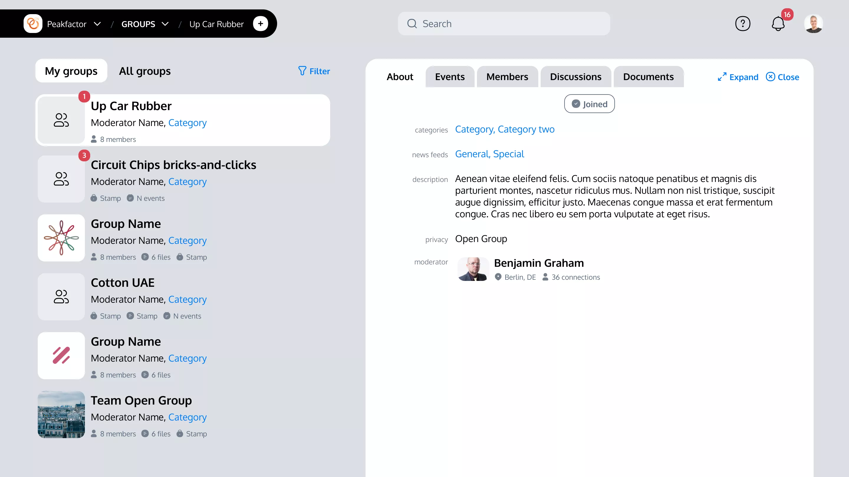
- Reintroduce the architecture of merged functionalities of Factor 1 and Factor 2 cohesively.
Research & Discovery
The research phase took into account the usability feedback from earlier versions of the tool. By analyzing admin functionalities and identifying potential enhancements, we laid the groundwork for a design that not only streamlines interactions but also significantly reduces the time users spend completing tasks.
Prototyping
Visual Design
Shaping clarity and efficiency for anyRM’s interface through the 3 milestones
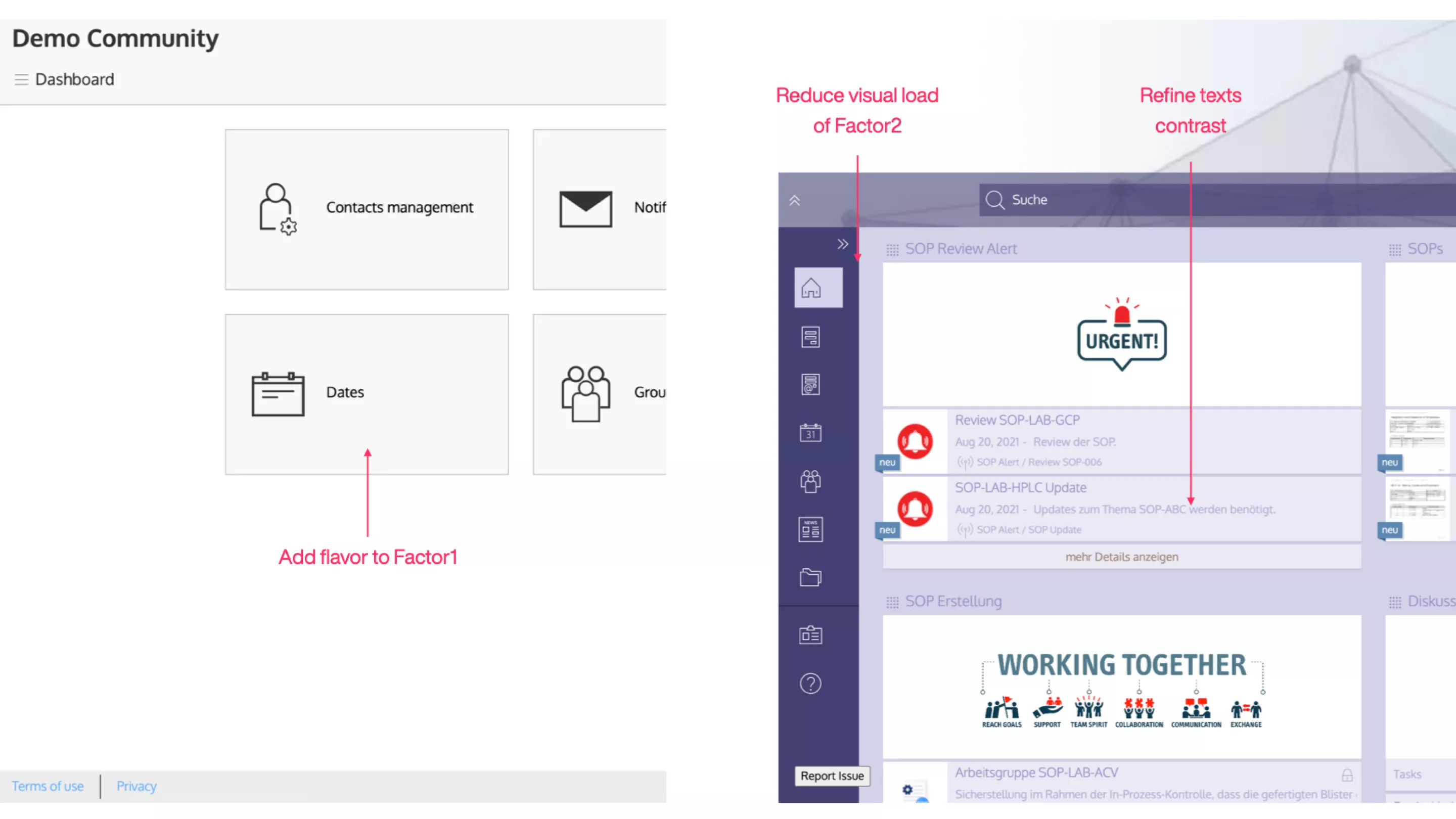
Step 1: Reviewing Factor 1
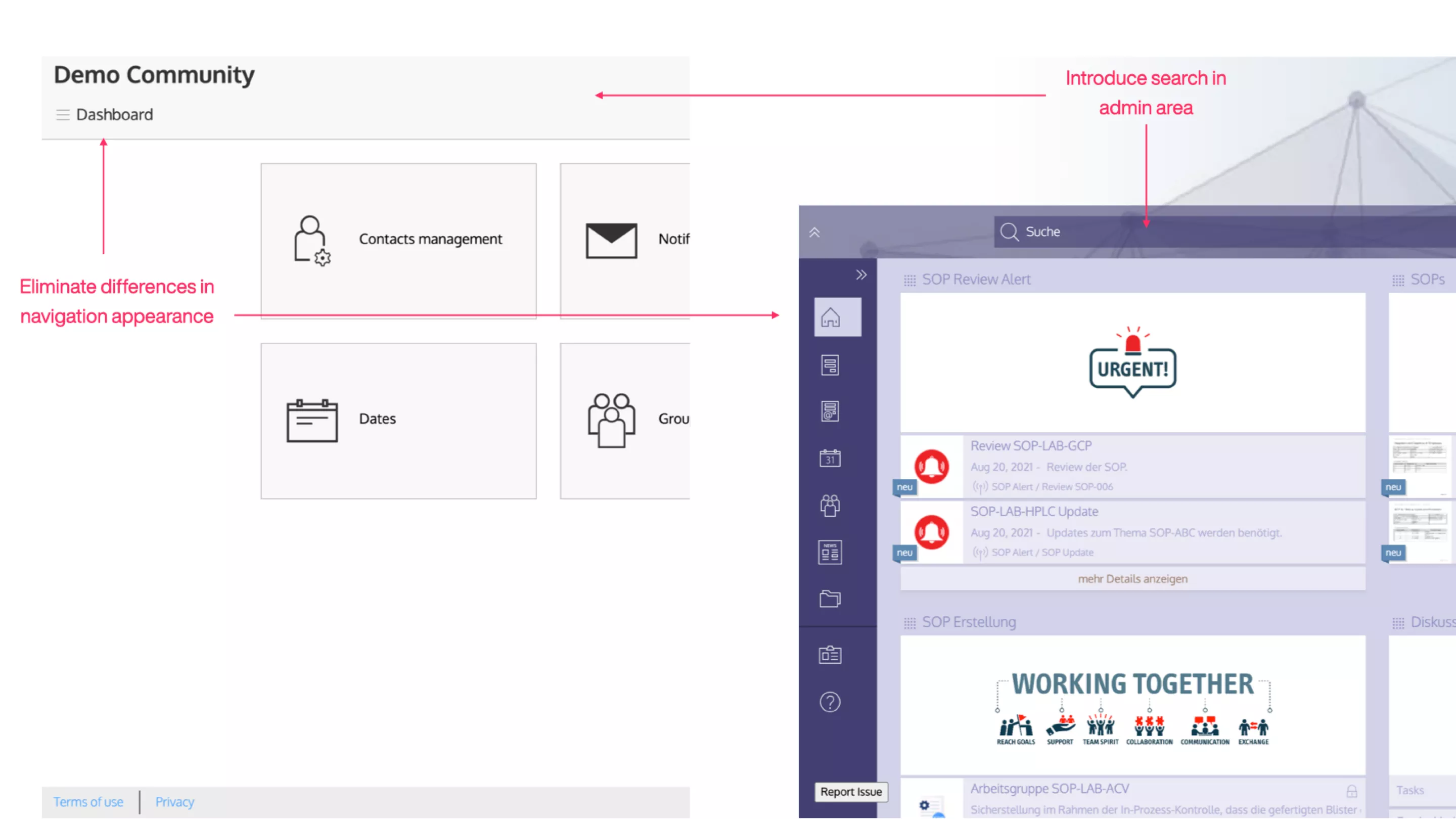
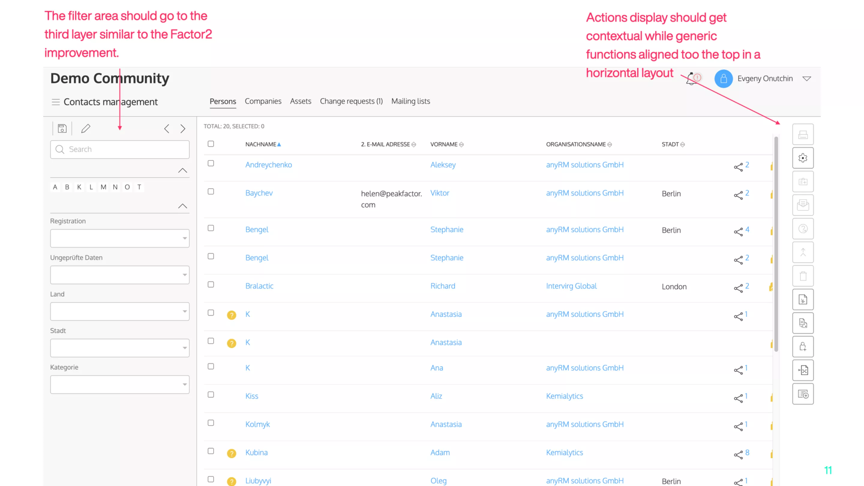
The journey started with a critical review of Factor 1, a system predating 2015, and a comparison to the Factor 2 generation. The phase focused on looking into the differences and offering a solution that covers the both systems.
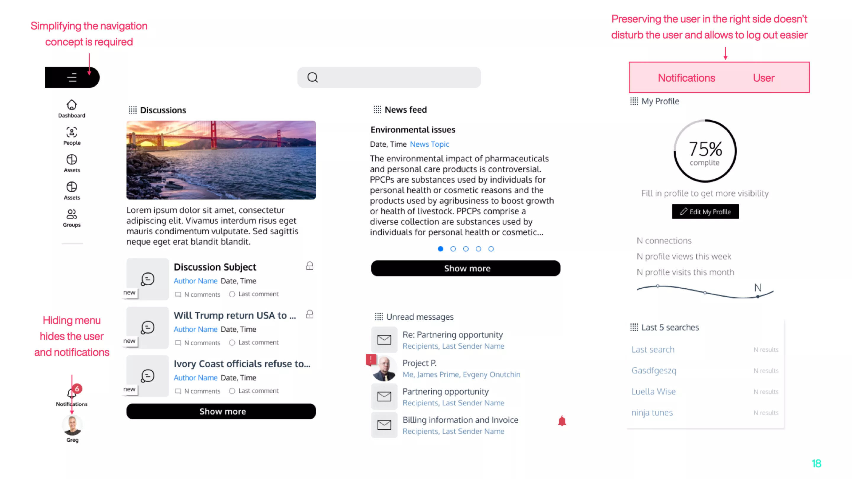
Despite the improvements proposed in these early drafts, our analysis indicated that the adjustments, although beneficial, did not fully meet our aspirations for usability enhancement. This step was crucial in laying the groundwork and identifying areas for further refinement to ensure a more intuitive user journey.
Step 2: Refining Factor 2
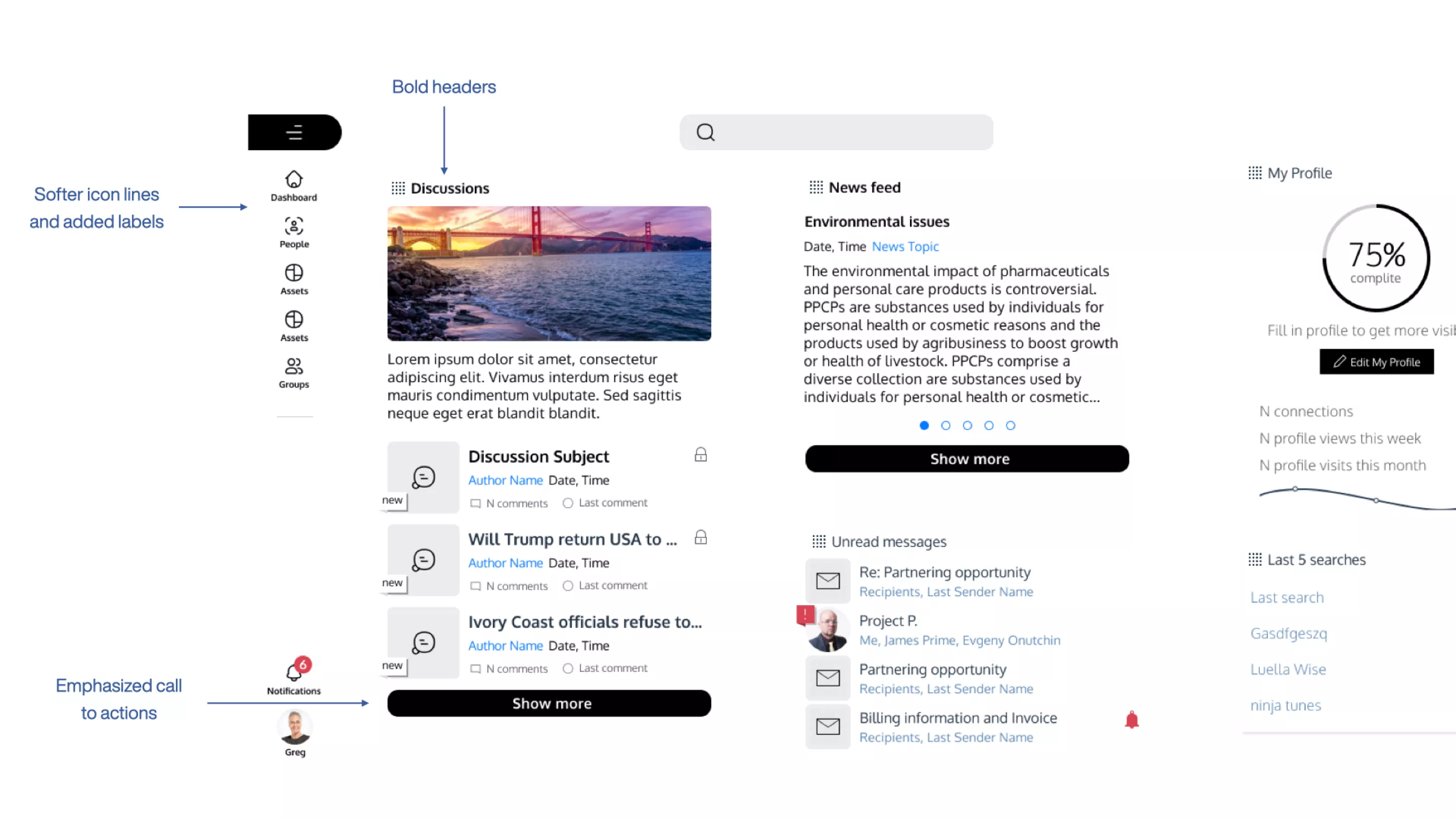
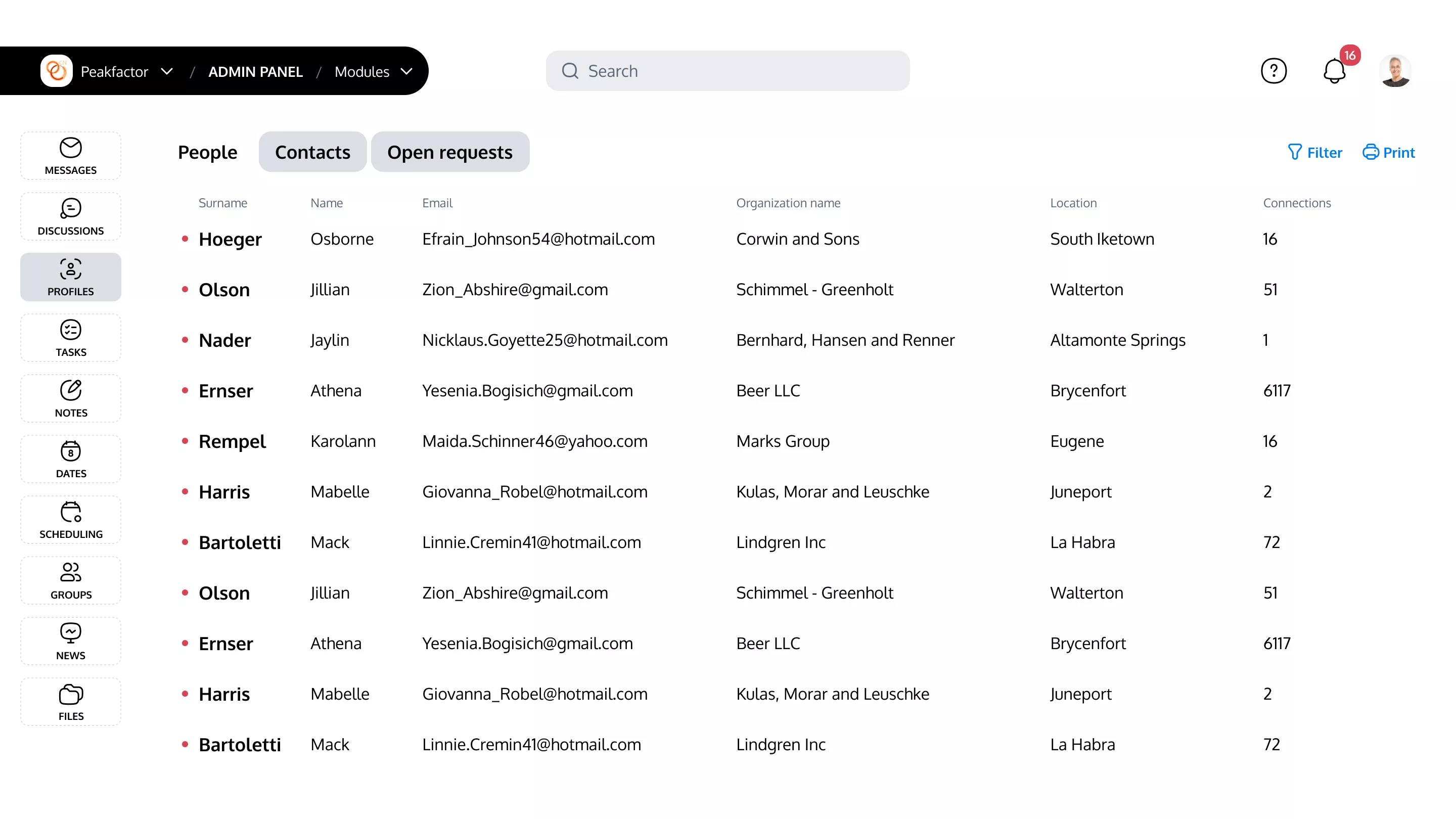
Following the navigation revision, the second step delved into a comprehensive analysis of the platform's visual language. Armed with insights from the previous phase, we executed changes to elevate the user experience.
This involved implementing refined design elements that addressed feedback on navigation and transitions, simultaneously working to reduce visual clutter for clearer, more accessible information presentation.
Step 3: Admin Area Makeover
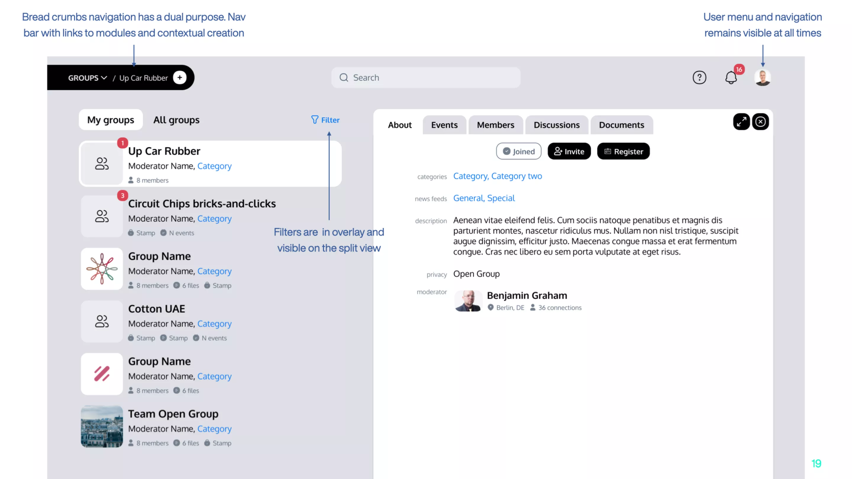
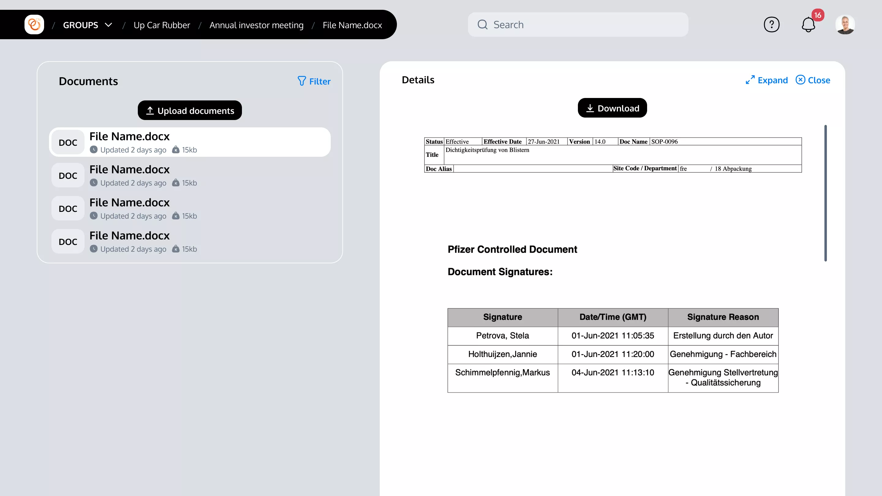
The final stride involved overhauling the admin area to blend the functionalities of both systems. This optimization was aimed at ensuring flexible use, accommodating a broad range of tasks without compromising on the ease of navigation or the clarity of the interface.
Color scheme & elements design
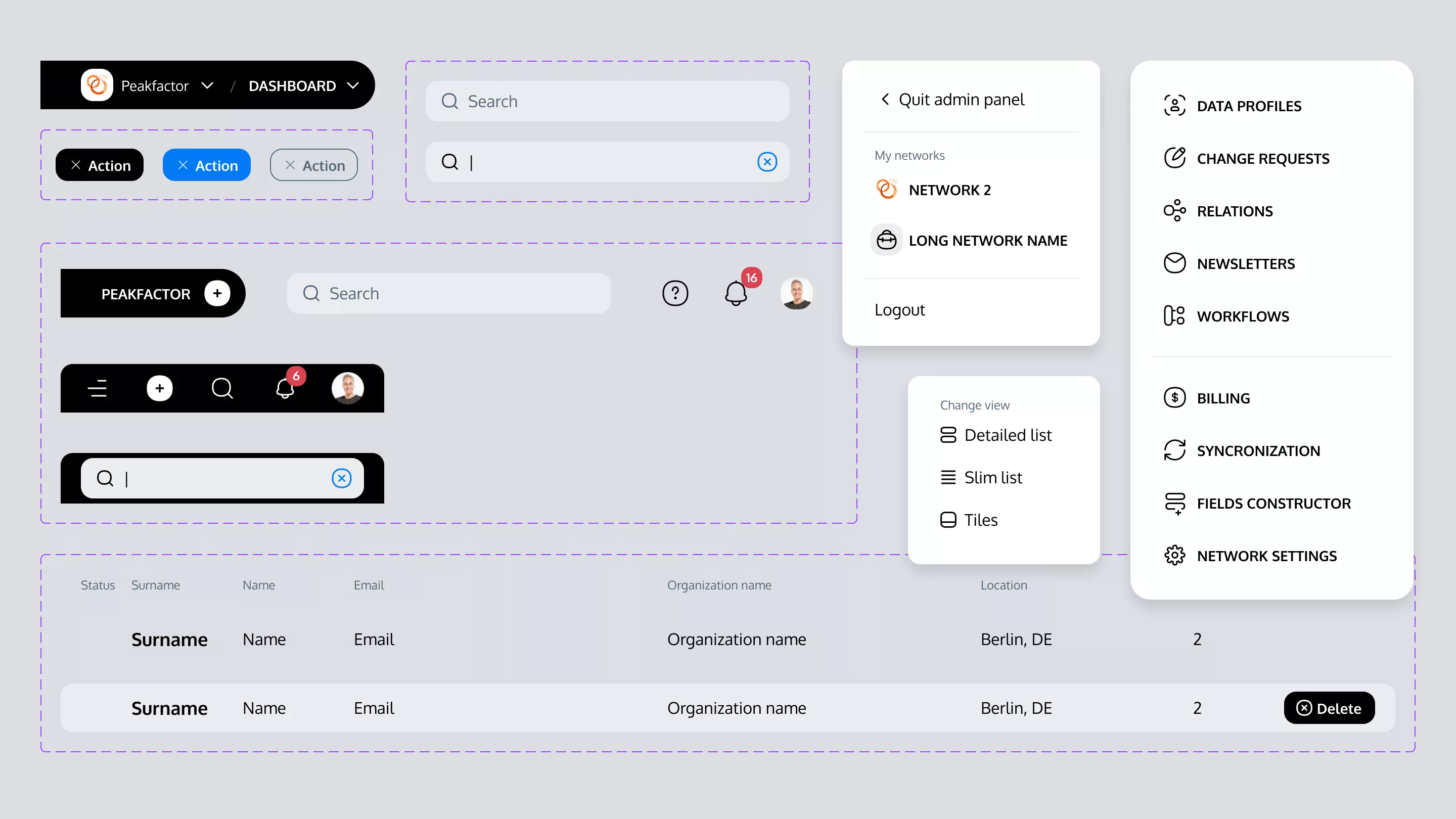
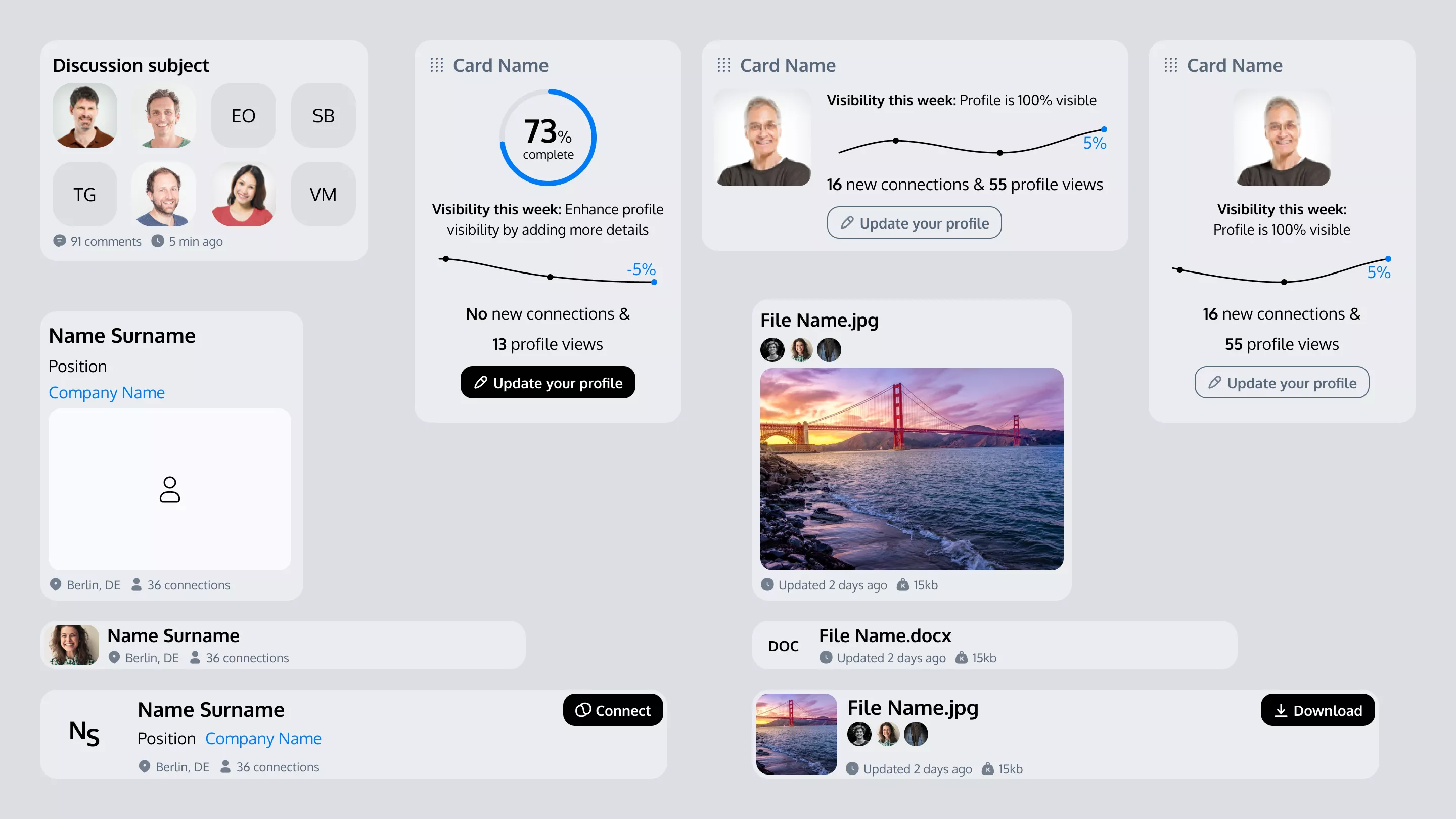
Creating design system with high contrast and soft curves
Throughout the project, the design transitioned from sharp, edgy forms to more approachable, rounded shapes, reflecting a modern, user-friendly mood. Integral to this approach was the adoption of the COCO icons set as the foundation for our iconography, seamlessly integrating with the overall design language.
Following the requirements we employed high contrast in actionable elements, enhancing visibility and reducing the risk of user errors, guiding our path toward a design that prioritizes clarity and usability.
Efforts were concentrated on decluttering the interface and introducing responsive design elements for optimal viewing on mobile and tablet devices, addressing the challenge of previously overwhelming navigation.
