Medloop mobile app
Bridging the gap between patients and practitioners
Medloop, a Medtech startup, established in 2018, aims to revolutionize patient-practitioner interactions. The application serves as a digital touchpoint, enabling users to share vital medical data securely with healthcare professionals.
My mission was to create an intuitive and user-friendly interface for Medloop's complex medical record mobile app. Within very demanding timeline and high workload, I optimized the app architecture, simplified usage, and successfully revised the app's user flows.
Medloop is serving two user groups: doctors managing an influx of patients, and individuals seeking a convenient way to monitor their health conditions using the mobile application. For the scope of this project, our focus was exclusively on optimizing the mobile application for these patients.
Design Strategy
- Under strict time constraints, we embraced a brisk, hackathon-like approach for this project.
- Aligning with client's request, we proceeded without user testing, adopting a strategy heavily reliant on our design expertise.
- Using “in-vacuum” design approach, we swiftly and efficiently addressed major functionalities the mobile app.
- Incremental changes facilitated a quicker design to development transition required by the Client.
- Armed with the initial design assets from the client, we layered on our own heuristics, leading to a significant overhaul of the app.
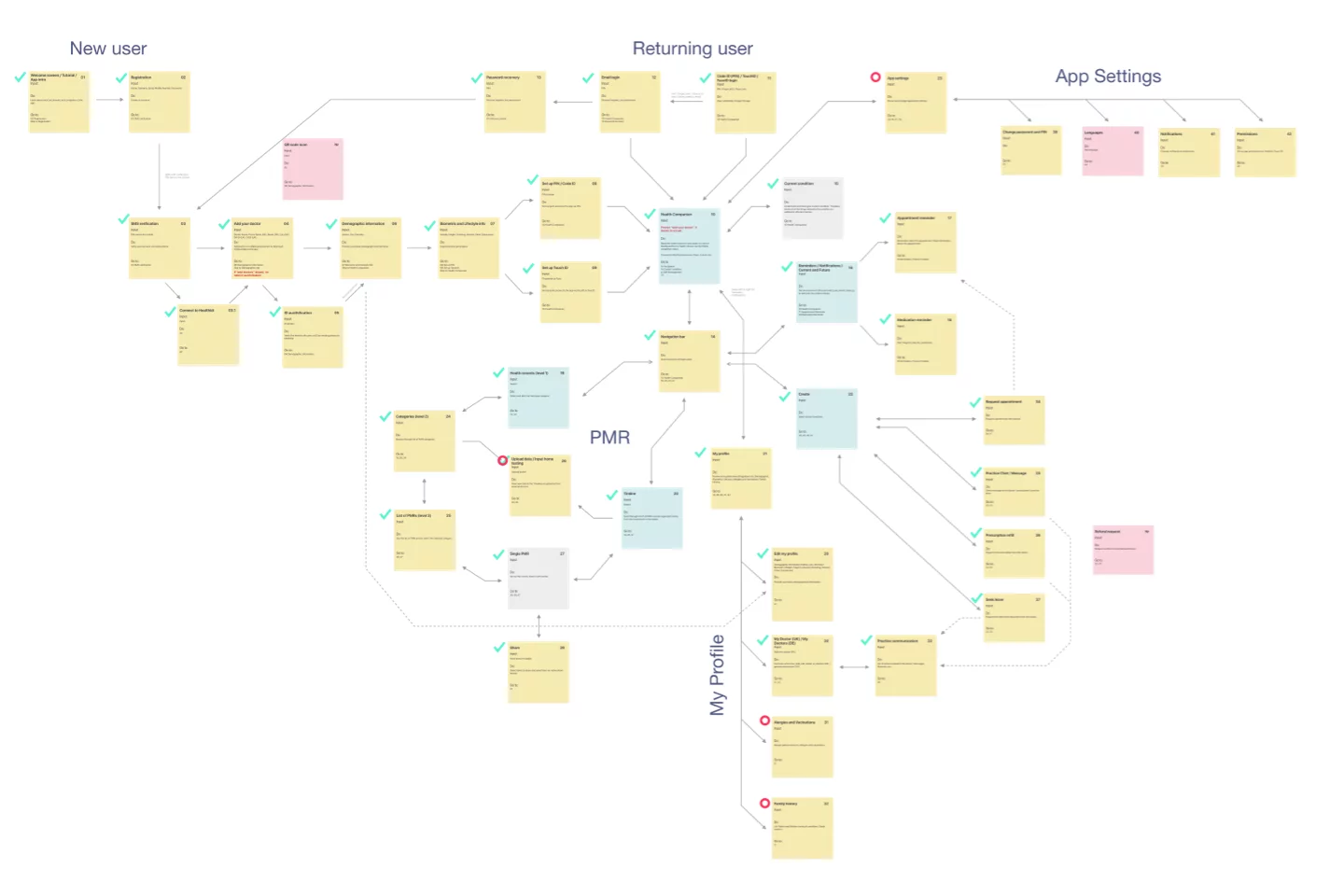
Research & Discovery
Our work was based on comprehensive client-provided data. The foundation enabled us to focus on design and development. Building upon the existing knowledge base, we were able to devise a comprehensive navigation map. This served as a roadmap for the app's functionality, ensuring a user-friendly interface and seamless user journey.
Prototyping
We embraced rapid iteration cycles built of quick incremental improvements on every item. This dynamic approach to prototyping allowed us to produce a wide array of design variations in a relatively short span. Each cycle brought us closer to a solution in tune with the project's requirements, highlighting our commitment to agile design practices.
Visual Design
Crafting visual aesthetics for a seamless health monitoring experience
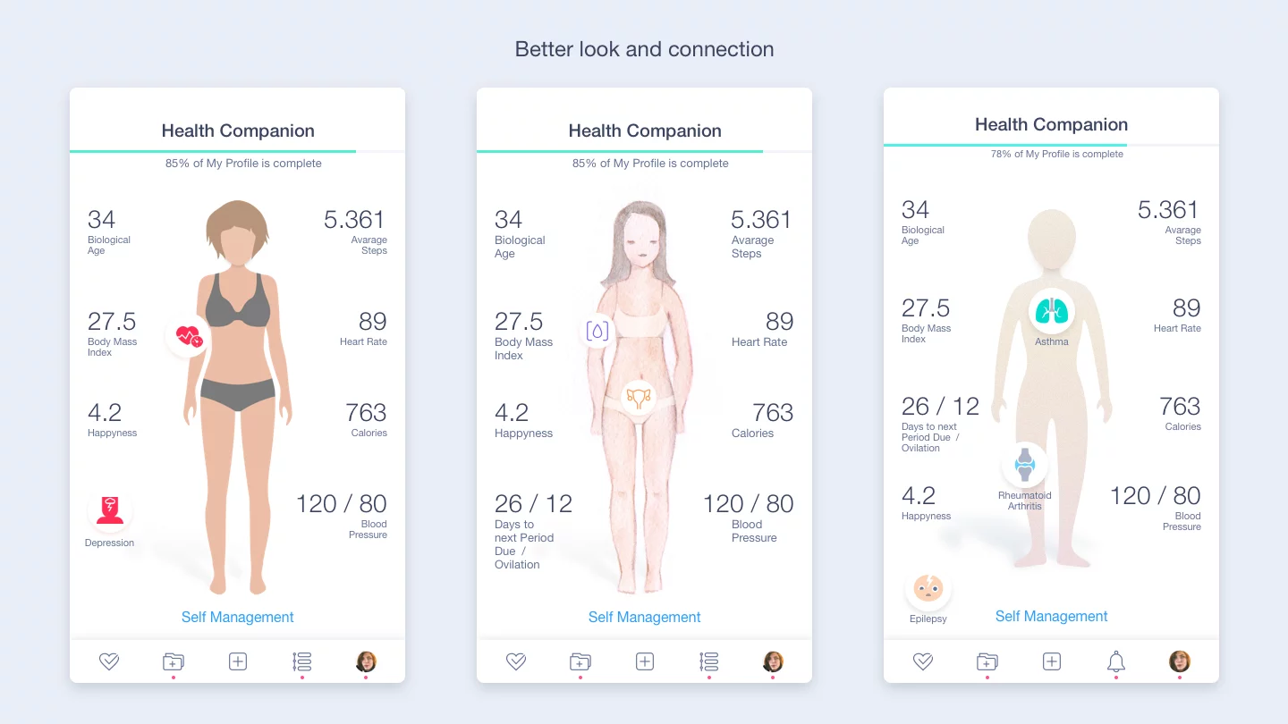
Crafting an inclusive visual for the Health Companion screen
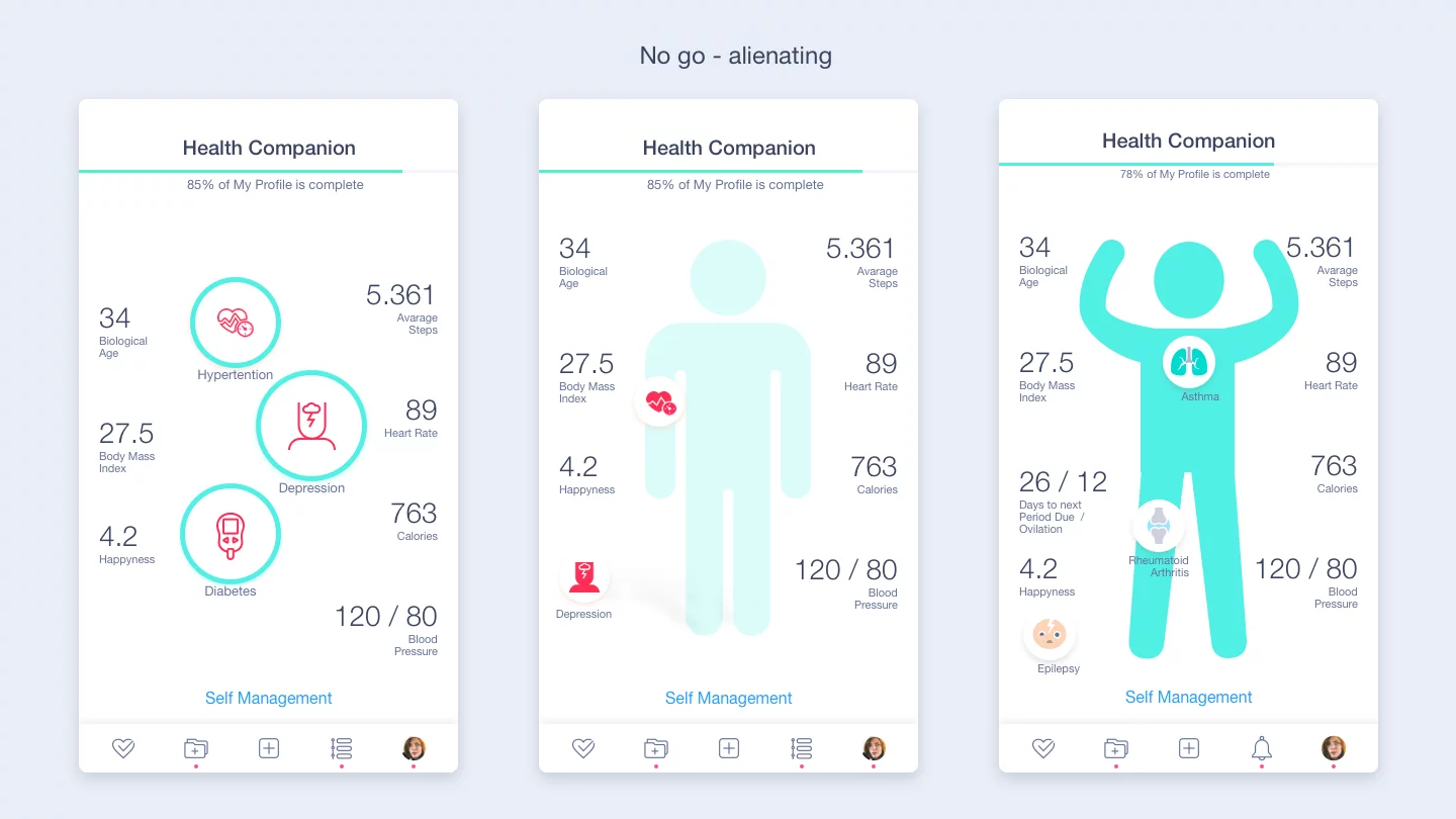
Designing the "Health Companion" home screen presented some unique challenges, primarily due to the specific requests concerning the "alien" body depiction in the brand colors (pic.1) . It was an unconventional direction that significantly contrasted with general preference for a sleek, flat design.
Eventually, we settled on an evolution from an illustrated figure to a more anonymous silhouette. This approach allowed us to maintain neutrality in physical characteristics like haircuts or facial expressions, avoiding any unwanted bias or specifications in appearance.
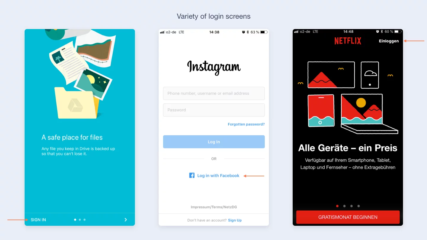
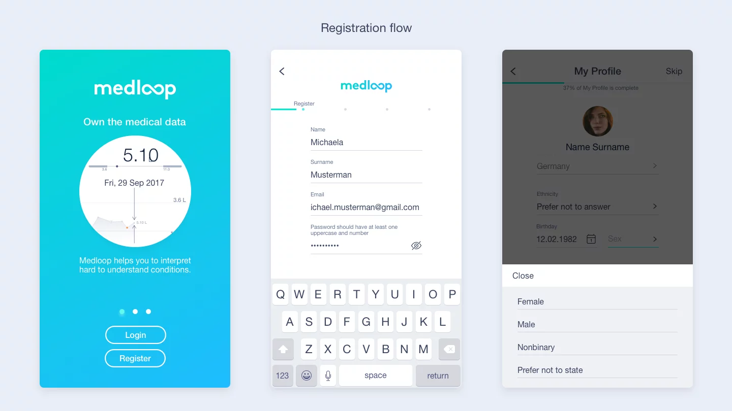
Steering the tailored approach for onboarding standardization
The onboarding process required a careful balance between thorough information collection and user-friendly design. The client requested a standard design approach. However, we quickly realized that a common onboarding flow isn't quite fit into feasible for a medical app.
The nature of medical apps necessitates collecting more detailed private information than most other services, presenting a unique challenge. We were tasked to design an onboarding experience that would ensure compliance and privacy while maintaining user engagement and trust.
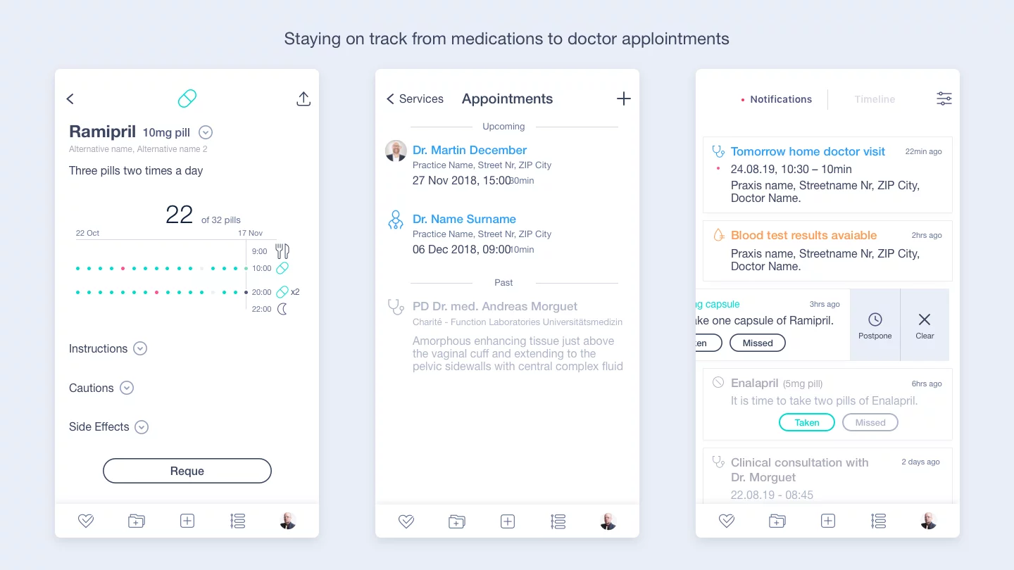
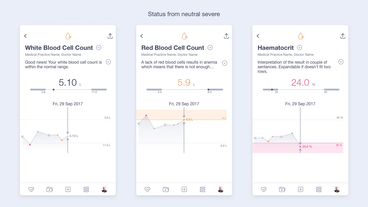
Balancing sensitivity & clarity on health status in the app
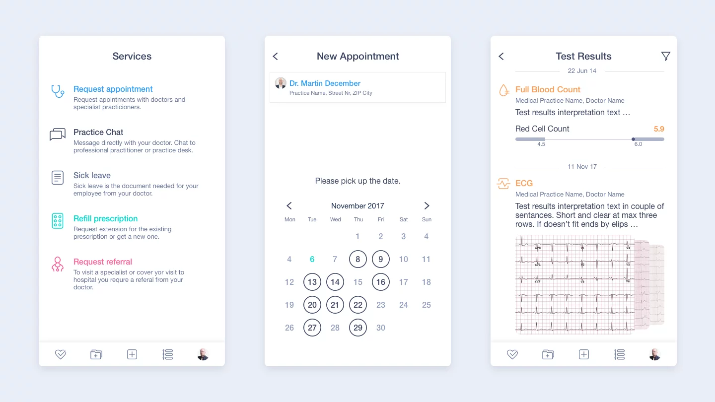
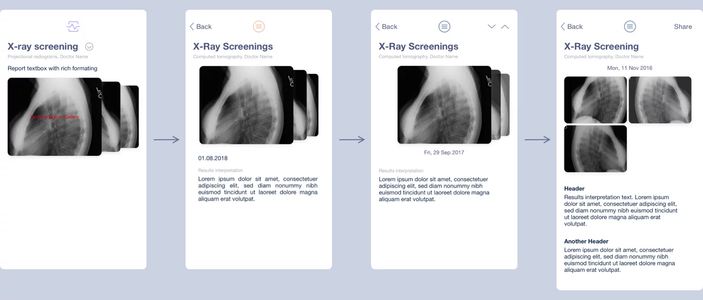
When it comes to designing status tracking screens for a health app like Medloop, it's crucial to strike a balance between clarity of information and sensitivity to the user's situation. Health-related changes need to be discernible without causing undue stress.
An app must accurately track and present critical data, such as medication intake and doctor appointments, in a calm, reassuring manner. It's not just about staying on track, but doing so with a respect for the patient's emotional wellbeing.
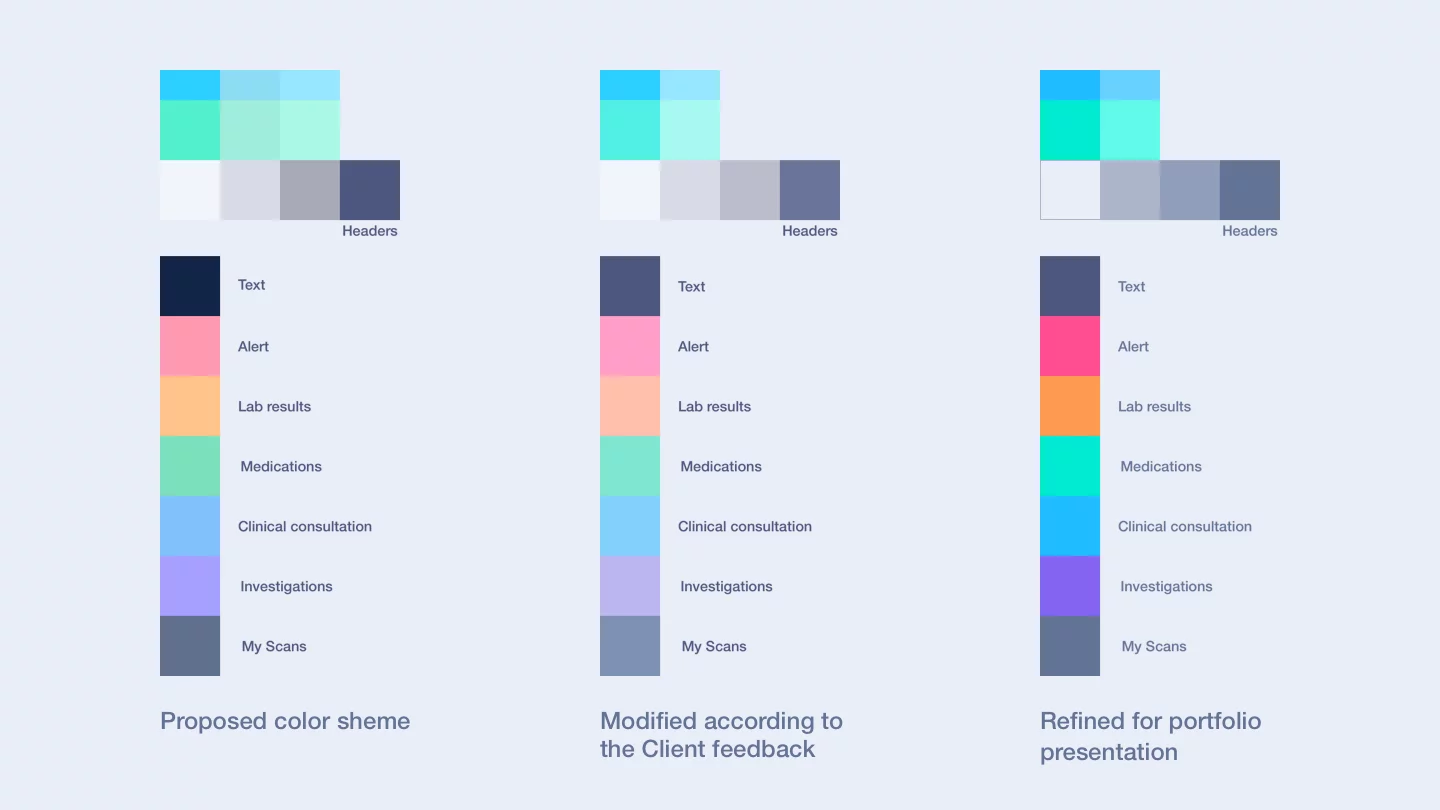
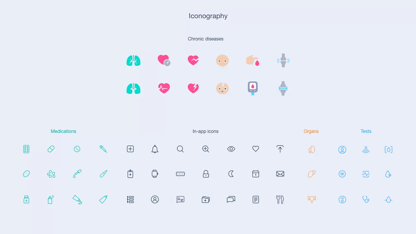
Color scheme & elements design
Balancing softness and clarity with Medloop's color palette evolution
Initially, the Medloop project featured a muted color palette in line with the client's wishes to promote app's friendliness. However, we enhanced color intensity in the project presentation to optimize readability and user engagement.
The design elements bear a minimalist, outline style, instilling a clean and contemporary feel to the app. The iconography is simplified yet detailed, aiding quick comprehension and reducing visual clutter. This aesthetic choice makes navigation intuitive and contributes to the overall user-friendly design.