As someone who has spent years working in the design field, I've observed a few things worth sharing. Firstly, designing applications and services for developers requires a certain level of constructive thinking and organization.
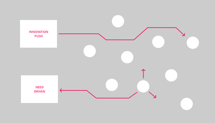
There is a fundamental problem that plagues many interfaces today. The problem comes from the natural tendency to break down complex functions into simpler pieces which is crucial for further development. Managers and developers put in the majority of effort to understand the system and how to develop it. But not on the grouping and simplification of information for the user interface. This often results in fractured menus and functions that lead to confusing, cluttered, and challenging-to-comprehend interfaces.
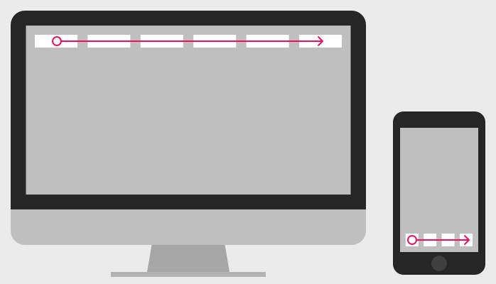
Fractured interfaces with multiple dialogs and dropdowns require a lot of mental effort from users, which often is overwhelming. Streamlining the interface by merging functionalities makes the application more user-friendly, easier to understand, and reduces cognitive load. This allows for a coherent product story that guides users to their goals, leading to a better user experience.
On the other hand, I've also noticed designers misunderstanding the goal of user experience. By trying to introduce the maximum available actions to the user, designers create the same problem of a cluttered and confusing interface. Designers must strike a balance between providing enough functionality to meet the user's needs and keeping the interface clean. For users, it's essential to have functionalities and actions only relevant to their specific context.
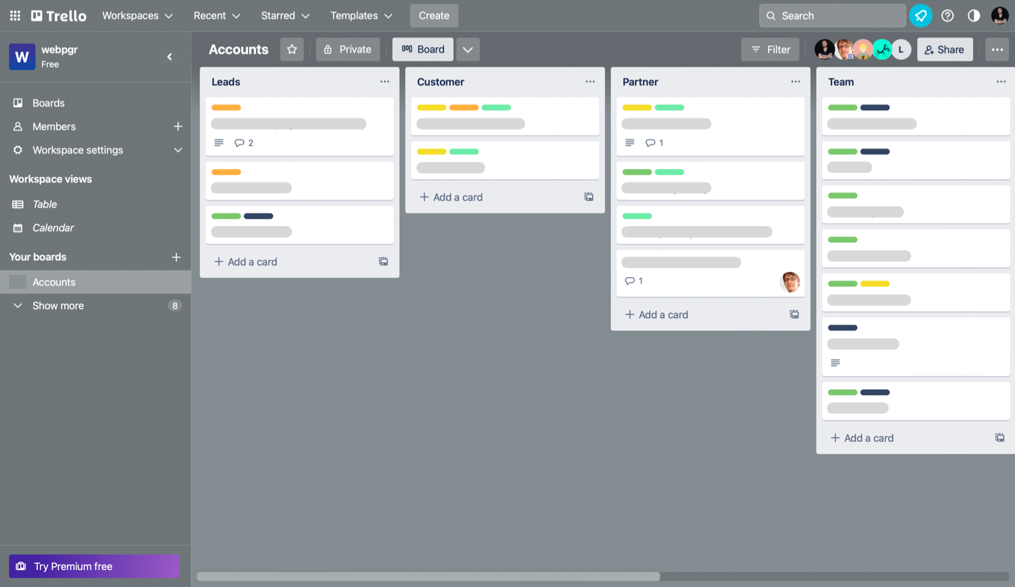
To illustrate this point, let's take a closer look at two popular task management apps: Trello and Asana. While both apps offer similar functionality, the way that the information is presented makes a big difference in the user experience.
Trello is known for its simple and visual design that allows users to organize tasks using cards that can be moved around on a board. Each card represents a specific task, and users can add labels, checklists, due dates, and attachments to each card. The interface is clean and intuitive, making it easy for users to quickly understand and start using the system.
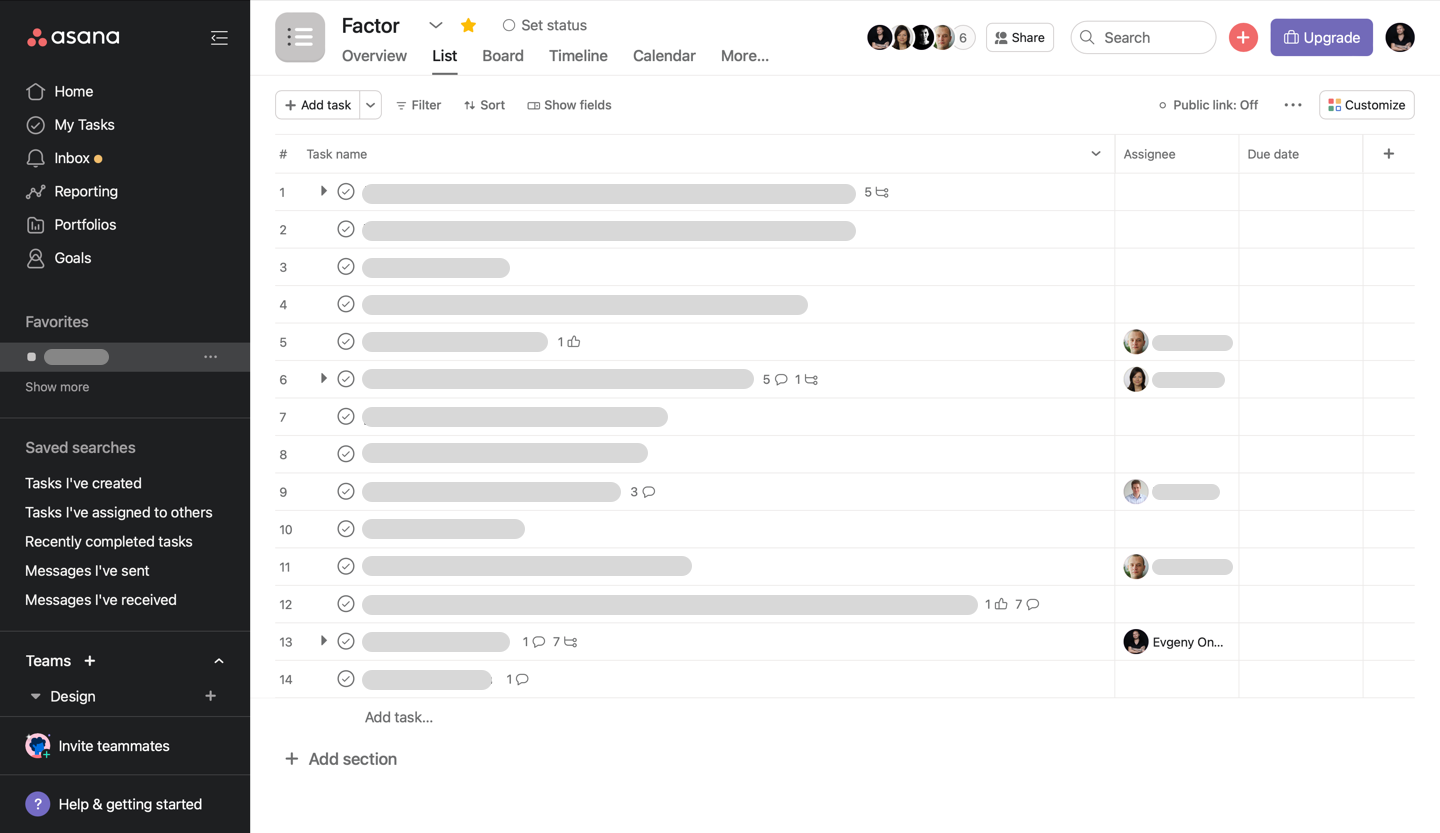
While Asana does offer more functionality than Trello, it is often difficult for users to figure out how to use it effectively. On the other hand, Asana offers a more complex and detailed interface that provides more functionality but can also be overwhelming for some users. The interface includes multiple tabs, sections, and menus that users must navigate to access all the features.
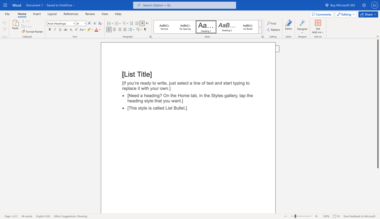
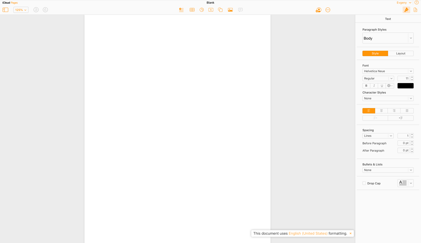
For a more concrete example, let's compare the interfaces of Microsoft Word and Apple Pages. Word is often touted as the superior word-processing application, but this is largely due to a sense of familiarity. In reality, Pages wins on all parameters. Because its actions and functionalities appear on demand rather than unfolding all the possible actions in the multiple tabs. This makes the interface more streamlined and easier to navigate, reducing cognitive load for the user. By contrast, Word's interface can feel cluttered and overwhelming, particularly for new users who may need to become more familiar with its features. Ultimately, effective interface design is about finding the right balance between providing enough functionality to meet the user's needs while keeping the interface clean and intuitive.
Ultimately, the task of a designer and everyone else taking part in developing an app is to combine related information points into one comprehensive image that links to the larger picture. This is much like putting together a puzzle, where each piece is important and must be carefully considered to create a complete and cohesive interface.
In conclusion, observing and recognizing such fracturing is essential. Fixing the mess is the key to better usability. By paying attention to the details and taking the time to carefully analyze and merge elements, designers can create truly effective and engaging designs for their users.