Apheris data collaboration tool
Fostering secure data collaboration for machine learning
Apheris, a pioneer in secure data collaboration, offers a platform where data providers and data scientists can securely and effectively collaborate. In 2019, the world faced challenges due to regulatory constraints and data distribution across departments, preventing the usage of data applications from being built.
My mission was to empower Apheris with an interface that fostered a sense of security and cultivated trust. With a focus on minimally obstructive design, This goal was essential due to the sensitive nature of the data the platform would handle. The challenge lay in designing a system that was not only secure but also user-friendly.
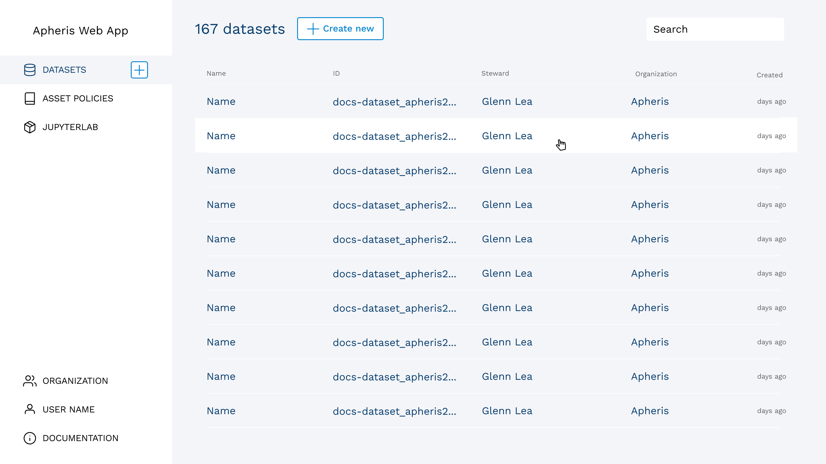
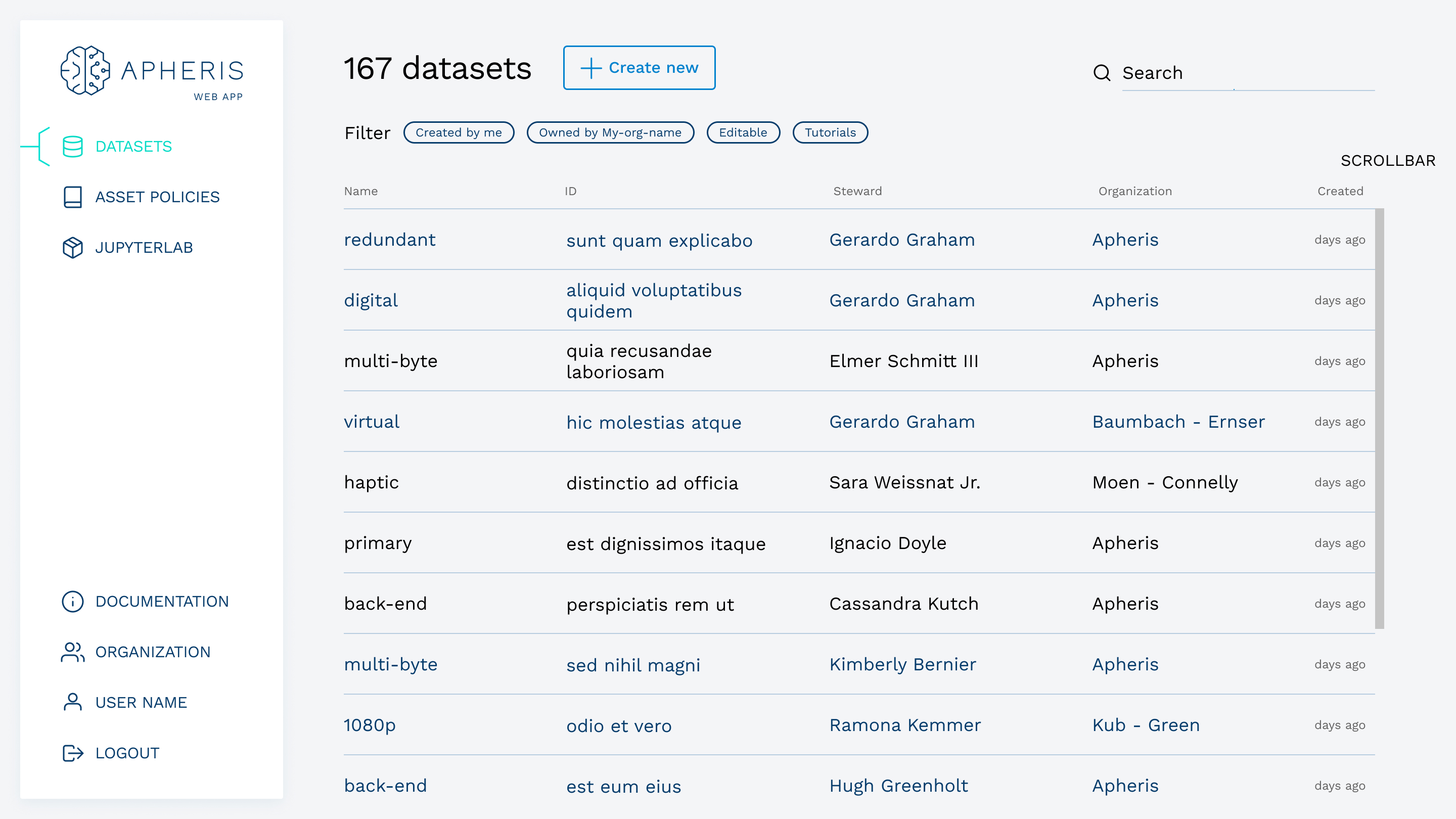
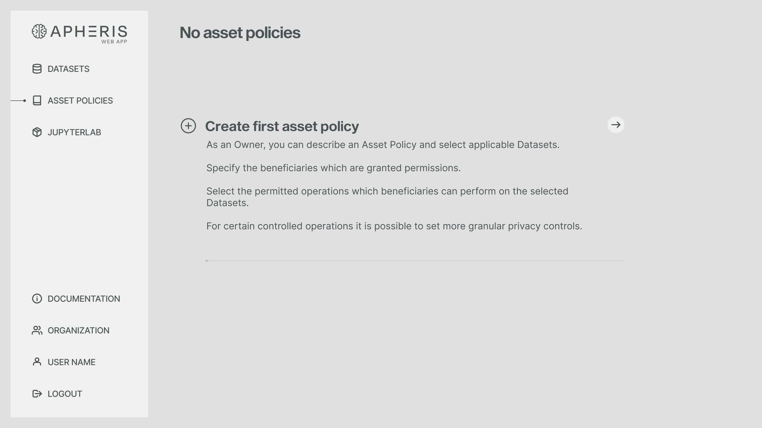
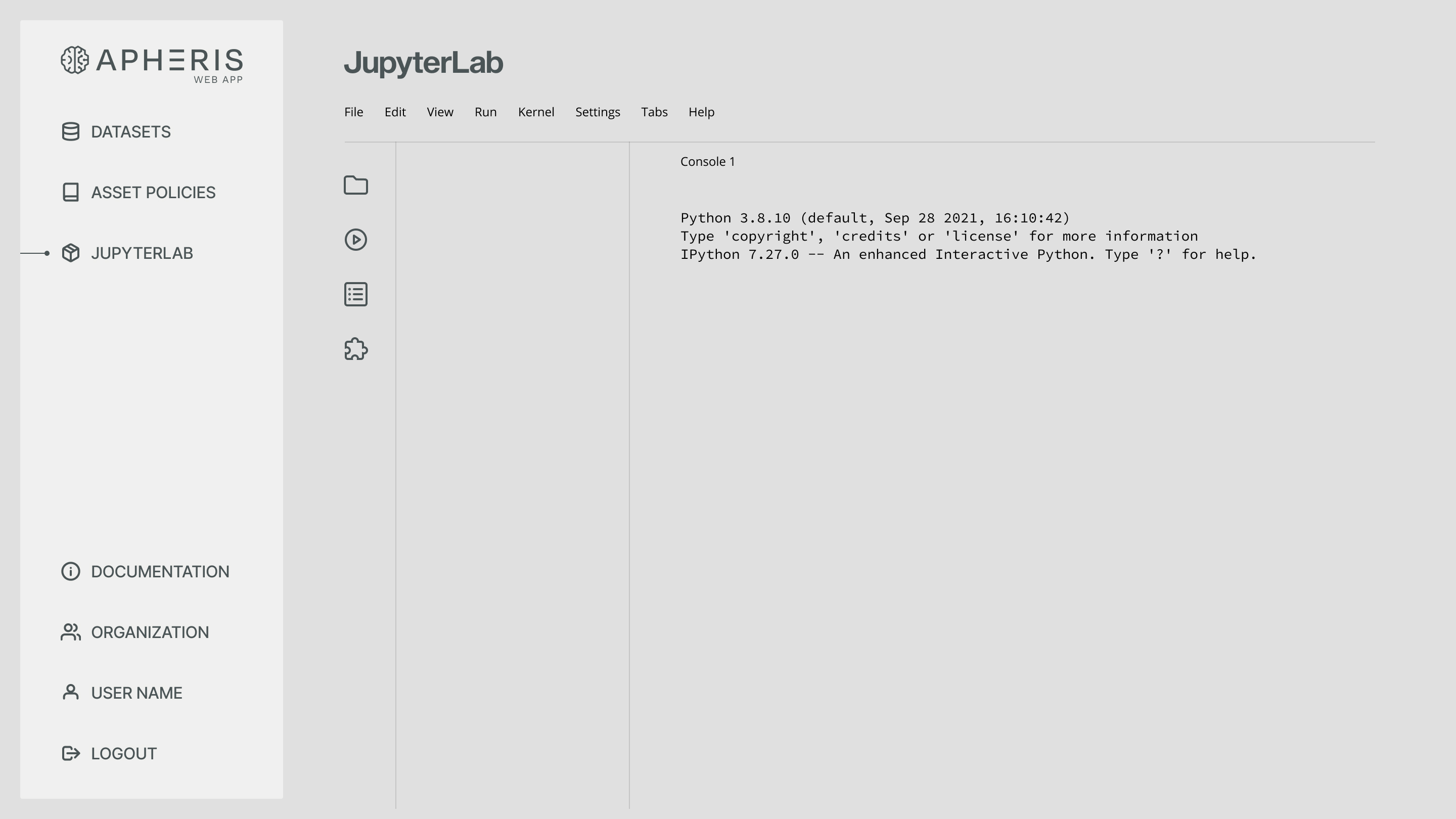
The platform serves two main user groups: data providers who want to share their data securely, and data scientists looking for a safe environment to analyze data. With the integration of JupyterLab, an open-source Python shell, data analysis and computations are made accessible within the platform itself.
Design Strategy
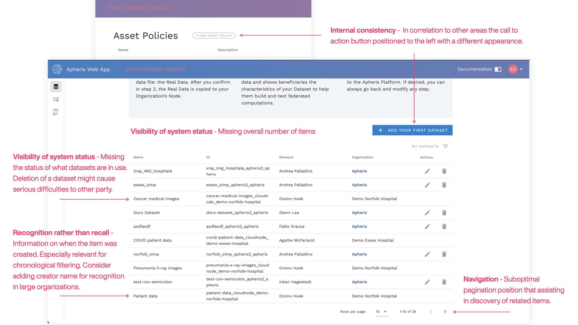
- Strengthening usability, efficiency, and visual clarity through expert evaluation
- Applying established interaction principles from Nielsen, Molich, and Shneiderman
- Structuring information architecture and user flow for predictable navigation
- Supporting consent, review, and security requirements within the interface
Research & Discovery
With the heuristic evaluation and feedback collected from the product's beta version, we initiated the discovery phase. Our focus was on creating a user-centric design that promotes secure and efficient data collaboration. Examining the market trends, competitors, and audience led us to create an interface that aligns with the expectations of its end users.
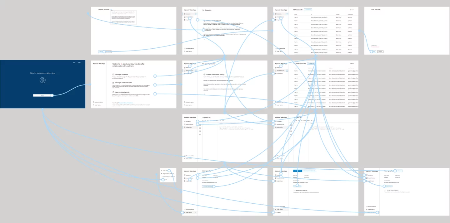
Prototyping
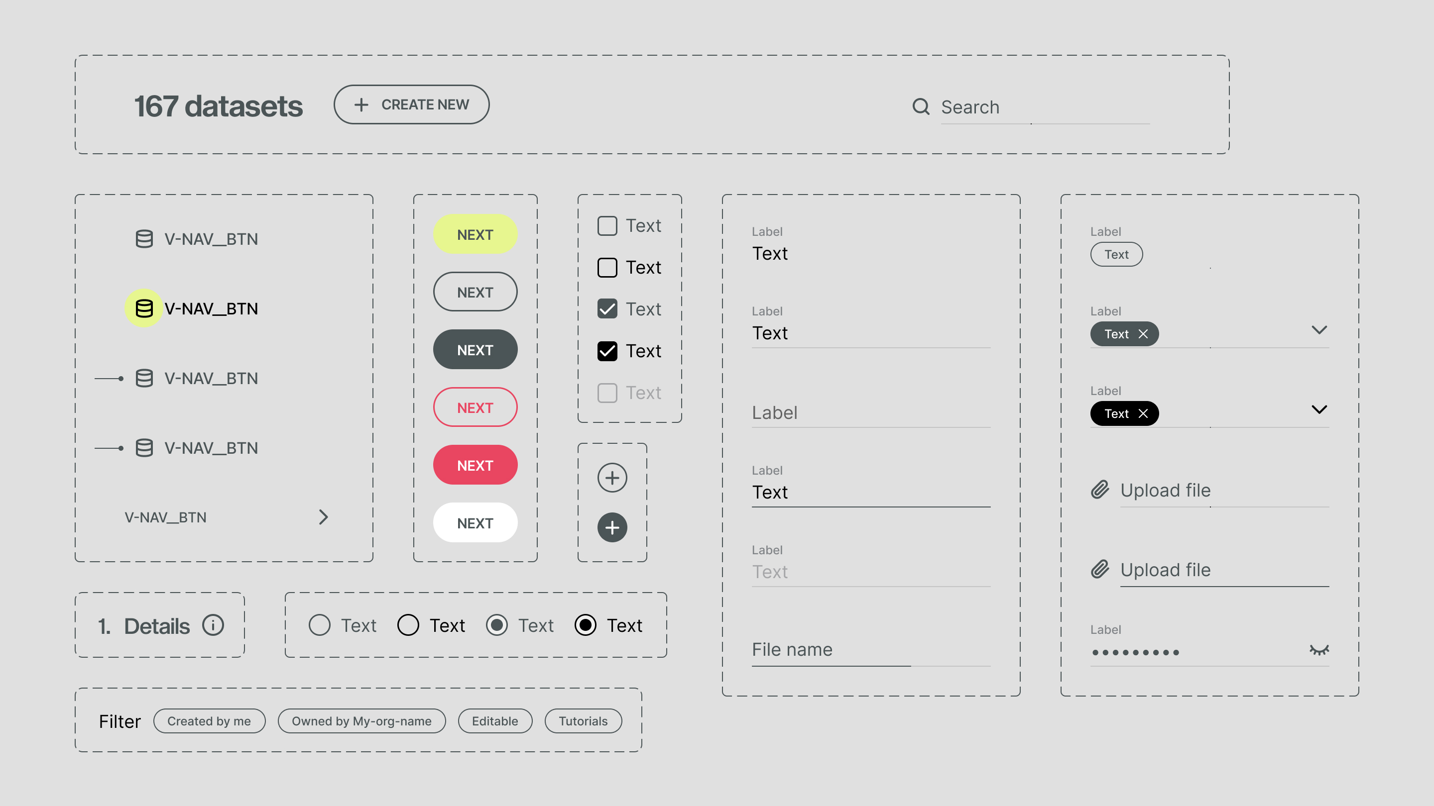
The user flow we constricted was relatively straightforward. Our objective was to ease users into the platform, guiding them seamlessly from one function to the next.
However, as the project advances and the product continues to evolve, the user flow became more intricate. This progression mirrored the growth of the platform itself, as it expanded to accommodate more complex features and functionalities.
Visual Design
Orchestrating hyper minimalist visual appearance for efficency
Crafting a simplified canvas
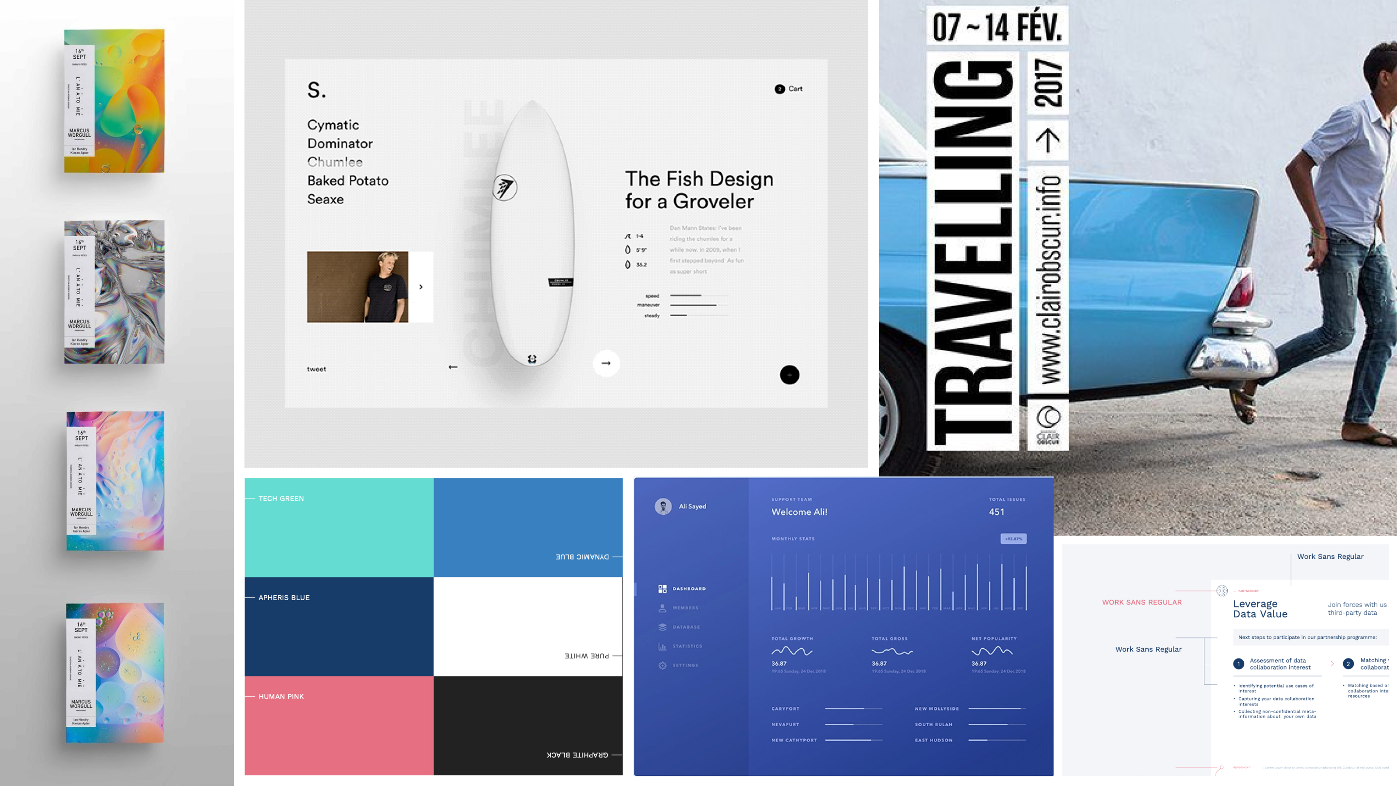
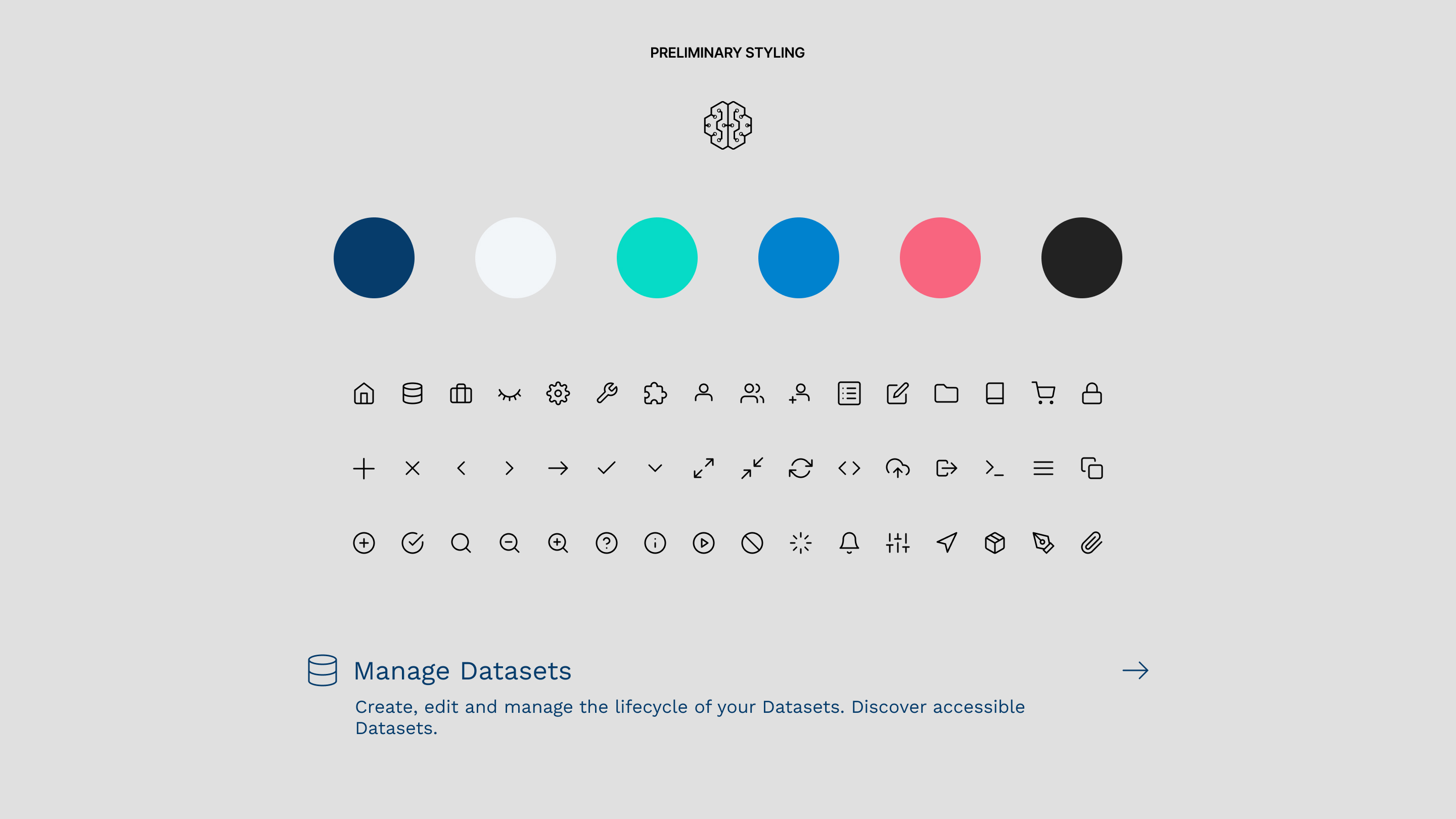
Our visual design process for the Apheris platform followed an ultra minimalistic approach. By maintaining simplicity, we aimed to support the efficient workflows of users. This strategy was embodied through three distinct phases in our design process.
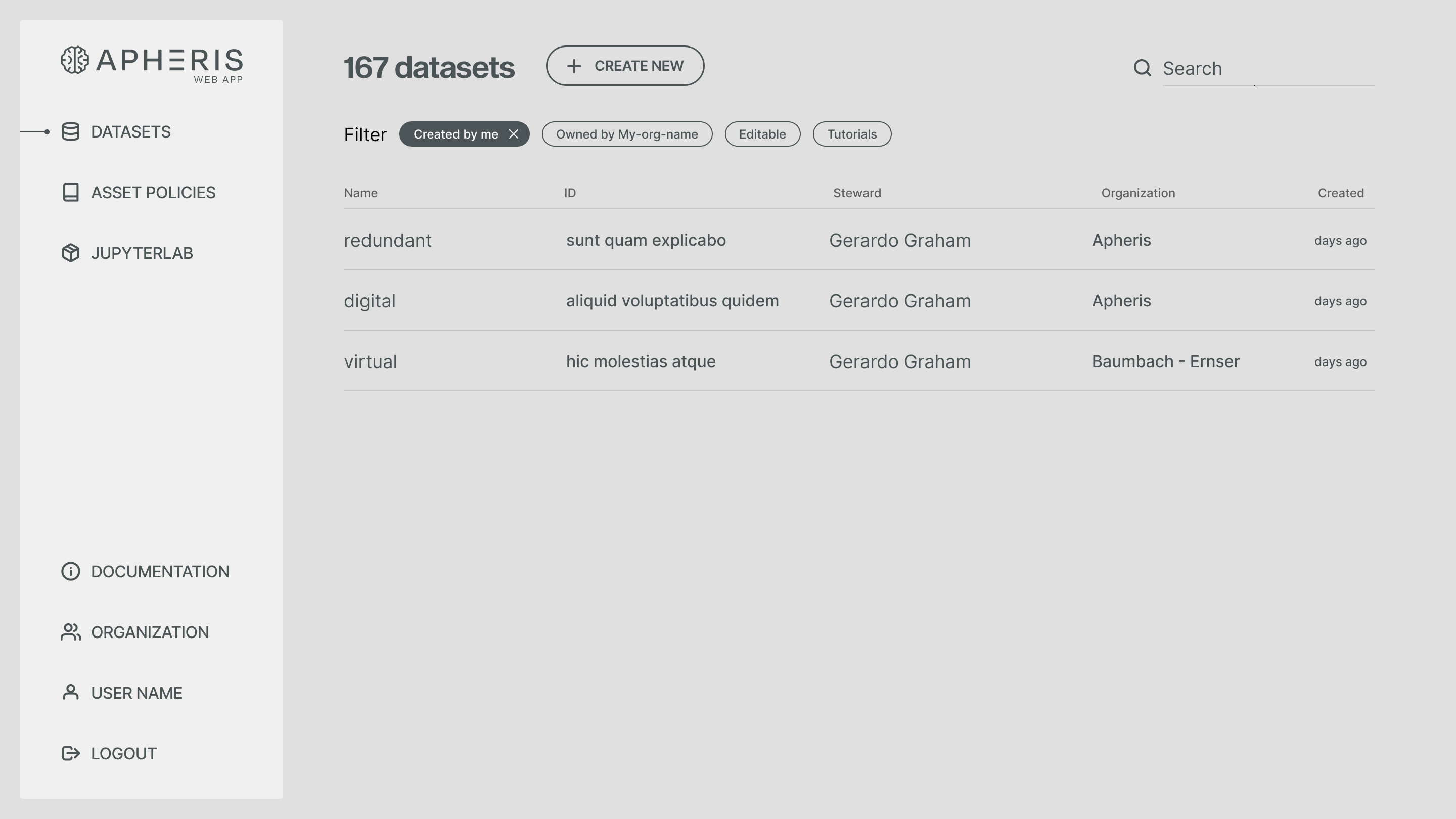
In the initial phase, our interface revolved around an oversimplified plain canvas. We intentionally kept color variations to a minimum, subtly distinguishing between menus and lists. This minimalistic layout served to reduce visual noise, allowing users to focus on their data-oriented tasks.
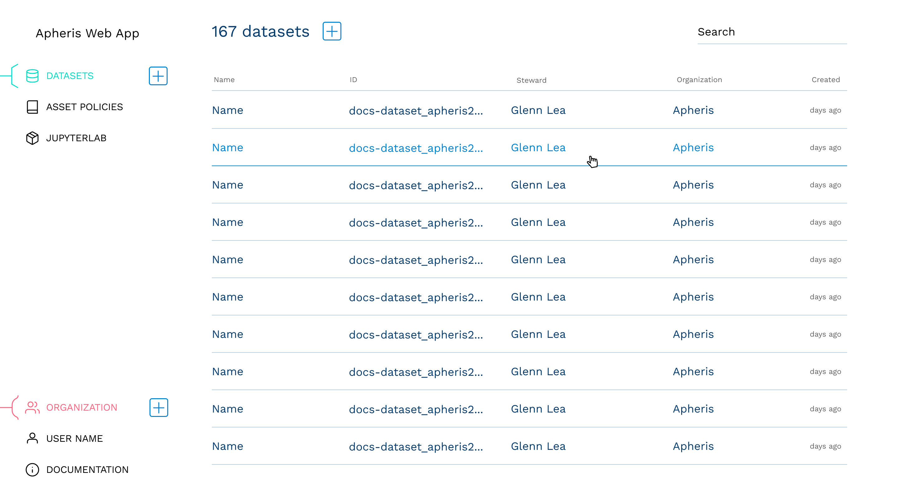
Elevating the menu layer
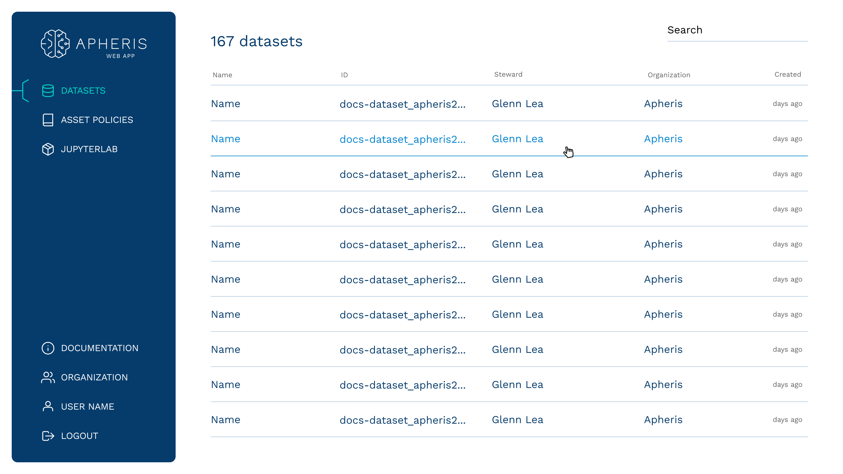
In the second phase, we undertook visual exploration that led to the enhancement of the menu's presentation. The menu was given its own card, creating a material like design. This gave the menu an upper layer, enhancing its prominence and accessibility within the overall interface.
We experimented with high contrast menu, intending to further differentiate the elements. However, the high contrast threatened to overwhelm users over the time and were thus discarded.
Color scheme & elements design
Refining the palette of trust & symbols of comfort
Initially, the design was closely anchored to Apheris' colors, laying the groundwork for our design. The second color scheme is direct inheritance of the refreshed branding and website made by another design agency.
Our design philosophy for Apheris revolved around creating an inviting and trustworthy interface. Refined branding that landed in our hands promotes a sense of ease and comfort. For that we established a compact design system that maintains consistency across the tool.

User Testing
Final design
Falko Krause